The logos of esports teams are as creative as those of traditional sports clubs. The most trendy ones include unique monograms, animal mascots, playing with colors and shapes. Read this article to learn how the brand identities of popular esports teams were created and what meaning is hidden behind them.
Team Liquid
The history of branding began in 2001 when one of the Teamliquid website users drew a banner with a horse inspired by Jim Warren’s painting. Since then, this symbol has always accompanied the team’s corporate identity. The image conveys a sense of community, strength, speed, and confidence.
The last version of the logo appeared in 2016. It is a simple geometric image of a circle with the profile of a horse’s head with a mane waving in the breeze.
Fnatic
The symbolism of one of the strongest European teams is designed as a monogram. Although at first glance the picture resembles a hieroglyph, one can clearly see the letters “F”, “I” and “C” included in the name.
The design is based on a grid of circles which makes the pattern look harmonious. The combination of smooth lines and sharp angles creates contrast, and the orange color draws attention to the monogram.
Cloud9
A creative identity may appear by accident as in the case with Cloud9. A professional designer has already developed a logo for the team when one of the fans offered his version. This is exactly the version that has become the official logo that has been popular for many years.
The logo features three nines that are intertwined to form a cloud. At the bottom, the inscription “Cloud9” is placed. The main color of the brand identity is blue which is associated with the sky and the team’s name.
Evil Geniuses
One of the most recognizable and stylish logos in esports is the white monogram “EG” against a dark blue background. The round shape performs two functions at once: it reflects inclusiveness, one of the core principles of the brand and helps to balance the outlines of both letters.
In 2020, the logo was improved: the circle was torn in the center, creating the illusion of a vertical line. And the serifs that appeared on the symbols symbolize the risk and innovation the Evil Geniuses is famous for.

T1
After the rebranding in 2019, the players got a new logo. It used to be a classic circle with the inscription “T1” with wings in the center which was surrounded by the full name of the team “SK Telecom. Pro Game Team”.
After shortening the name to “T1”, the logo also became simpler. The circle and additional inscriptions were removed, and the wing was added to the letter “T”. The slanted font and the red color convey the gamers’ energy and dynamics.

Natus Vincere
“Born to win” is how the name of the team is translated from Latin. This message is represented by a bright logo. The contrasting black-and-yellow color palette conveys optimism and self-confidence. And the large monogram “NAVI” with missing elements in the letters attracts attention, is easy to remember, and demonstrates the creativity of the Natus Vincere players.

Astralis
The team’s branding is also inspired by Latin: the word “astralis” means “star”. The logo features a white five-pointed star placed inside an irregular-shaped red star with four angles.
OG
The designers developed a stylish monogram for gamers: a dark blue elongated hexagon in the form of a shield with the name “OG”. The sharpened outlines of white letters repeat the shape of the figure they are inscribed in.

Virtus PRO
The logo’s dominating symbol is a polar bear, the brand’s mascot. The muzzle with a threatening grin breaks out of the letter “V” which refers to the name Virtus PRO. The black-white-orange color palette looks contrasting and attracts attention.

Ninjas in Pyjamas
An unusual name was invented for fun, and then it was firmly entrenched as the successful team’s official name. The first two versions of the identity were monograms, but in 2012 the players got a new stylish logo.
In the center, we see the traditional weapon of the Japanese ninjas, shurikens. They’re designed as stylized stars with long intertwined tails.

Team SoloMid
This identity is an example of a classic style that is relevant at any time and is not subject to trends. The abbreviation “TSM” is placed in a circle formed by the bars of the letter “T”. The other symbols are placed symmetrically at the sides. The black and white colors are associated with style and chic, and the combination of rounded and pointed shapes gives the image a special touch.
FaZe
Though the bright geometrical logo can seem to be a simple set of lines, it is formed by a monogram of two “F”s located mirror-like. Initially, it was a red image against a white background. Later, black, blue, and yellow colors were added.
Optic Gaming
Another great example of a creative monogram in which the “G” is thread through the “O” ring. Both characters are extended in width and combine smooth lines and sharp angles. And the contrasting colors (black and bright green) add to the image volume and dynamics.
G2
The symbol is based on the image of the samurai helmet with the name of the brand. What’s interesting is that the logo has become so popular that many fans did tattoos with its image. The team owner promised that G2 would never change the logo out of respect for the fans.

PSG
The team performs under the auspices of the French football club Paris Saint-Germain, so their symbols coincide. In the center of the logo there is the Eiffel Tower, and the inscription “Paris Saint-Germain” is located around the circle. The red, blue, and white colors refer to the French flag. The symbols and color palette convey the patriotic message of the club.

Echo Fox
The gamers’ mascot has become a red fox, and namely its head and tail pictured on the logo. The harmony of smooth lines conveys a sense of dynamics. And the junction of the orange and white tail parts resembles a stylized combination of “E” and “F”.

Complexity
In 2019, the team decided on a radical rebranding that would reflect its development and goals. The gamers aim for being equated with ordinary professional sportsmen.
The visual representation of the new positioning was a star. Each of its five ends symbolizes the five elements of the brand (“5C”) which are competition, community, culture, cause, and convergence.
The blue-and-white color palette wasn’t chosen by chance: it is characteristic of the real football club Dallas Cowboys, the Complexity has joined with as part of a new strategy.
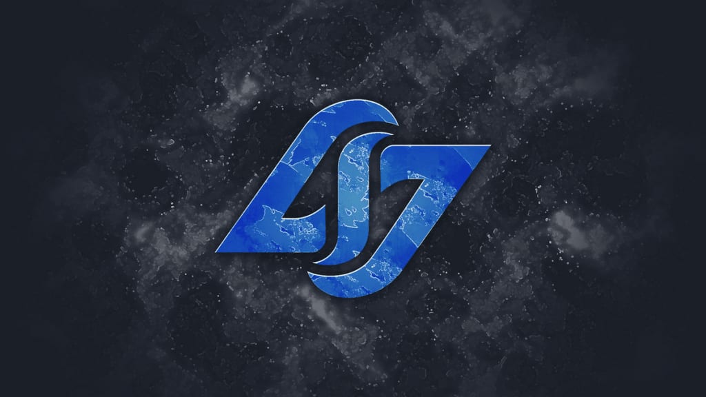
Counter Logic Gaming
The symmetrical three-letter monogram looks stylish and harmonious. The curved lines are associated with flexibility and the blue color – with calmness and confidence.
100 Thieves
To understand the brand’s identity, you have to analyze its name. By “thieves” the brand means people who take from life what is not given to them by looking for opportunities, overcoming obstacles, and learning new things. The number 100 means a hundred percent performance to achieve the result.
This idea is represented by an expressive logo: the black inscription “100 Thieves” seems to be made by hand with many strokes. The slanted letters, underlining, and missing elements convey dynamics and aggression.

Popular Brand Logos
