How to Choose a Font for Your Logo
Dive into the dynamic world of logo animation, where creativity knows no bounds, and learn how to bring your brand to life with an interactive logo design that not only captivates but also inspires and engages your audience in a whole new way.

Starts at $0 + state fees and only takes 5-10 minutes
Font is an integral part of any logo. The importance of picking the right font should not be underestimated.
A well-selected font can emphasize the advantages of your logo and brand, while an inappropriate font may evoke nasty associations and undermine trust.
While editing your logo in ZenBusiness, you can select the best font for your logo. To make the task easier for you, we’d like to share some useful information about font types and specifics.
Some of the major fonts include:
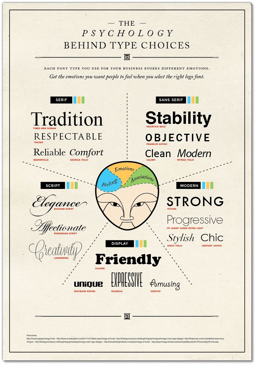
- Serif fonts feature serifs, i.e., small vertical lines at the end of each stroke. These classical fonts communicate respect to tradition, reverence, reliability, and comfort. Examples: Times New Roman, Trajan, Baskerville, Georgia Italic.
- Sans serif fonts have no serifs and have a more modern look. They channel aspiration, novelty, and neatness. Examples: Helvetica Bold, Franklin Gothic, Calibri, Myriad Italic.
- Script fonts look as if they were written with a pen. Such fonts communicate elegance, creative thought, and tenderness. Examples: Bickham Script, Edwardian Script, Lavanderia.
- Modern fonts are straight new-style fonts that stand for decisiveness, progress, elegance, and style. Examples: Futura, ITC Avant Carde Extra Light.
- Display fonts are peculiar job fonts which are uncommon on logos. Such fonts express emotional richness, uniqueness, and friendliness. Examples: Cooper, Spaceage Round, Valencia, Giddyup.

Tips on choosing the best font for your logo:
1. Keep it simple.
A logo with a clean font is easier to reproduce across different products. Remember that you may have to enlarge or reduce it. Make sure your logo looks attractive on any surface, whether it’s a large banner, a pen, or promotional materials.
2. See what fonts your competitors are using.
Your goal is not to imitate but to analyze whether their solutions are smart. Only learn from successful experience.
3. Use a font to reflect your brand identity.
A font makes your logo recognizable and memorable. Find out which font suits your company best. Is it serious, clean, and neat? Or is it playful, airy, and chaotic? Does it communicate novelty or does it cling to traditions and conservative ideas?
Different industries rely on different values which are communicated through different fonts. A solid law firm and a bridal shop will not have similar logos. Take into account the kind of product or service you’re offering. Identify your target audience. Figure out which of your business attributes you’d like to highlight.
4. Do not use too many fonts.
One font (or two tops) is your best choice. More fonts may look ugly and arouse distrust among potential clients. Note that high-profile companies focus primarily on just one font. Smaller businesses tend to use different fonts for a company name and a slogan.
5. Do not use trendy fonts.
Trends are short-lived; what is popular today may be forgotten tomorrow
If you want your business to prosper for years to come, do not let fickle fashion fool you. Pick a font that reflects your company’s values and characteristics.
Disclaimer: The content on this page is for information purposes only and does not constitute legal, tax, or accounting advice. If you have specific questions about any of these topics, seek the counsel of a licensed professional.
Logo Resources
Ready to Start Your Business?


